4 Common Graphs (A to N)
This section covers covers common graphs and visualization techniques for examining your sample data.
Visualization Techniques:
- Bar Charts:
- Histograms:
4.1 Area Chart
4.1.1 Overview and Summary
4.1.2 Common Applications
4.1.3 Interpretation
4.1.4 Doing It In R
Coming soon
4.1.5 Sources and Useful Links
Sources:
Useful Links:
4.2 Bar Chart
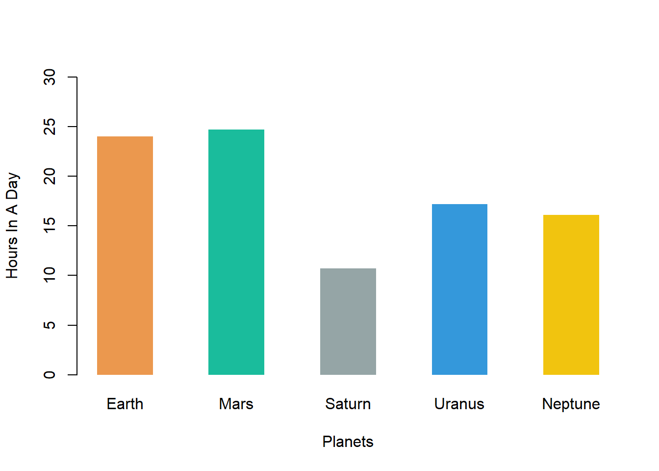
An example of a bar chart is shown below:
4.2.1 Overview and Summary
Bar charts are used to compare categorical variables. Usually on one axis is the categorical variable and on the other axis is a quantitative measure of that variable such as a count or the mean. Bar charts with the categorical variable on the x-axis are sometimes called column charts while bar charts with categorical variables on the y-axis are sometimes called row charts. In the above, we see a column chart with the categorical variable on the x-axis.
Bar charts are very similar to histograms except that typically histograms are used to depict quantitative variables as opposed to categorical variables.
4.2.2 Common Applications
Bar charts are useful to summarize and compare groups (or levels) of a categorical variable.
4.2.3 Interpretation
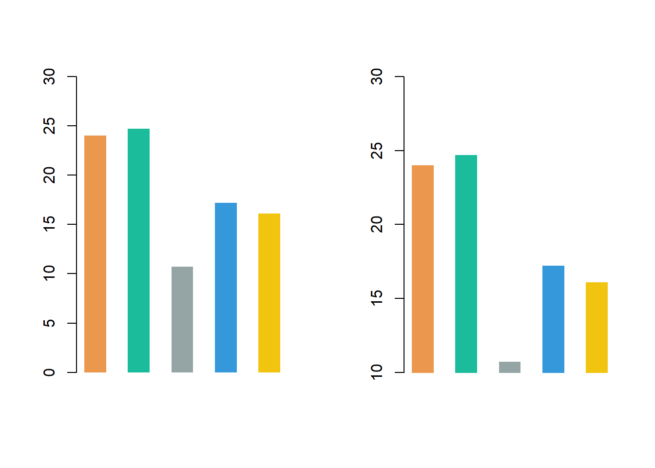
Generally, the height of a bar corresponds to the value of the quantitative measure. Do be careful during interpretation to examine the range on the axis for the quantitative measure. It is possible that the axis does not start at zero, thus leading to deceiving bar heights. This is seen below.
In the below, we see two charts that depict the exact same data and information. On the left, the bar chart has a y-axis ranging from 0 to 30. Note that the values are actually pretty similar to each other. On the right, we changed the range of the y-axis to be between 10 and 30. Note how visually, now it seems that the values are now much further from each other. The middle bar looks like it is less than 4 times the height of other bars.

Typically, practitioners do not adjust the y-axis to distort bar heights.
4.2.4 Doing It In R
In the below, we create bar charts where the categorical variable is planets using R. The below depict the number of hours in a day for different planets. Data is pulled on 9/27/2020 from NASA.
4.2.4.1 Bar Chart In Base R
Barcharts in base R can be created with the barplot() function. The below is an example with code.
hours = c(24, 24.7, 10.7, 17.2, 16.1)
planets = c("Earth", "Mars", "Saturn", "Uranus", "Neptune" )
display_color = c("#EB984E", "#1ABC9C", "#95A5A6", "#3498DB", "#F1C40F")
barplot(height = hours, # vector of numerical data
        space = 1, # changes the space between each bar
        names.arg = planets, # adds labels for the bars
        horiz = FALSE, # FALSE means bars are drawn vertically
        col = display_color, # vector of colors for your bars
        xlab = "Planets", # label for x-axis
        ylab = "Hours In A Day", # label for y-axis
        main = "How Long Are Days On Planets?", # title of chart
        ylim = c(0, 30), # range for the y-axis
        border = NA) # adjusts the borders of your bars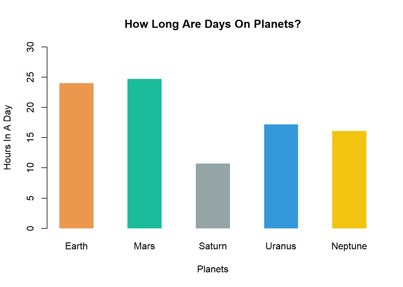
4.2.4.2 Bar Chart In ggplot2
Within the package ggplot2, barcharts can be created with the geom_bar() or geom_col() function. The below is an example with code.
library(ggplot2) # import ggplot2
df = data.frame("Planets" = c("Earth", "Mars", "Saturn", "Uranus", "Neptune" ),
                "Hours In A Day" = c(24, 24.7, 10.7, 17.2, 16.1), check.names = FALSE) # create dataframe of data
display_color = c("#EB984E", "#1ABC9C", "#95A5A6", "#3498DB", "#F1C40F") # colors for bars
g = ggplot(df, aes_string(x = "Planets", # data on x-axis
                          y = "`Hours In A Day`")) # data on y-axis
g = g + geom_col(fill = display_color, # change the color of the bar
                 width = 0.7) # change width of bar
g = g + ggtitle("How Long Are Days On Planets?")  # add title
g = g + theme(panel.background = element_rect(fill='#FFFFFF', colour='#95A5A6')) # edit background color
g = g + scale_y_continuous(expand = expansion(mult = c(0, .1)), # stretch plot to fit grid
                           breaks = round(seq(0, 30, by = 5),1)) # change interval for y-axis
g = g +   theme(axis.line = element_line(colour = "#95A5A6"),
                panel.grid.major = element_blank(),
                panel.grid.minor = element_blank(),
                panel.border = element_blank(),
                panel.background = element_blank(),
                text = element_text(size=12,  family = "sans")) # change font
g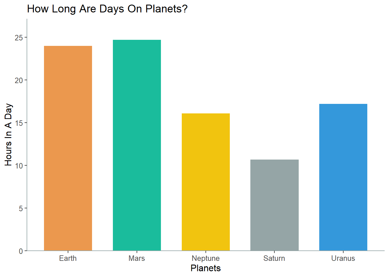
4.2.5 Sources and Useful Links
Sources:
Useful Links:
- https://ggplot2.tidyverse.org/reference/geom_bar.html
- http://r-statistics.co/Complete-Ggplot2-Tutorial-Part1-With-R-Code.html
- https://rstudio.com/wp-content/uploads/2016/11/ggplot2-cheatsheet-2.1.pdf
- https://stackoverflow.com/questions/20220424/ggplot2-bar-plot-no-space-between-bottom-of-geom-and-x-axis-keep-space-above/50697152
- https://stackoverflow.com/questions/32941670/width-and-gap-of-geom-bar-ggplot2
- https://stackoverflow.com/questions/10861773/remove-grid-background-color-and-top-and-right-borders-from-ggplot2
4.3 Bubble Chart
An example of a bubble chart is shown below:

4.3.1 Overview and Summary
Bubble charts are useful to depict three dimensional data. That is, when y
4.3.2 Common Applications
Bar charts are useful to summarize and compare groups (or levels) of a categorical variable.
4.3.3 Interpretation
Generally, the height of a bar corresponds to the value of the quantitative measure. Do be careful during interpretation to examine the range on the axis for the quantitative measure. It is possible that the axis does not start at zero, thus leading to deceiving bar heights. This is seen below.
In the below, we see two charts that depict the exact same data and information. On the left, the bar chart has a y-axis ranging from 0 to 30. Note that the values are actually pretty similar to each other. On the right, we changed the range of the y-axis to be between 10 and 30. Note how visually, now it seems that the values are now much further from each other. The middle bar looks like it is less than 4 times the height of other bars.
Typically, practitioners do not adjust the y-axis to distort bar heights.
4.3.4 Doing It In R
In the below, we create bar charts where the categorical variable is planets using R. The below depict the number of hours in a day for different planets. Data is pulled on 9/27/2020 from NASA.
4.3.4.1 Bubble Chart In Base R
Barcharts in base R can be created with the barplot() function. The below is an example with code.
hours = c(24, 24.7, 10.7, 17.2, 16.1)
planets = c("Earth", "Mars", "Saturn", "Uranus", "Neptune" )
display_color = c("#EB984E", "#1ABC9C", "#95A5A6", "#3498DB", "#F1C40F")
barplot(height = hours, # vector of numerical data
        space = 1, # changes the space between each bar
        names.arg = planets, # adds labels for the bars
        horiz = FALSE, # FALSE means bars are drawn vertically
        col = display_color, # vector of colors for your bars
        xlab = "Planets", # label for x-axis
        ylab = "Hours In A Day", # label for y-axis
        main = "How Long Are Days On Planets?", # title of chart
        ylim = c(0, 30), # range for the y-axis
        border = NA) # adjusts the borders of your bars
4.3.4.2 Bubble Chart In ggplot2
Within the package ggplot2, barcharts can be created with the geom_bar() or geom_col() function. The below is an example with code.
library(ggplot2) # import ggplot2
df = data.frame("Planets" = c("Earth", "Mars", "Saturn", "Uranus", "Neptune" ),
                "Hours In A Day" = c(24, 24.7, 10.7, 17.2, 16.1), check.names = FALSE) # create dataframe of data
display_color = c("#EB984E", "#1ABC9C", "#95A5A6", "#3498DB", "#F1C40F") # colors for bars
g = ggplot(df, aes_string(x = "Planets", # data on x-axis
                          y = "`Hours In A Day`")) # data on y-axis
g = g + geom_col(fill = display_color, # change the color of the bar
                 width = 0.7) # change width of bar
g = g + ggtitle("How Long Are Days On Planets?")  # add title
g = g + theme(panel.background = element_rect(fill='#FFFFFF', colour='#95A5A6')) # edit background color
g = g + scale_y_continuous(expand = expansion(mult = c(0, .1)), # stretch plot to fit grid
                           breaks = round(seq(0, 30, by = 5),1)) # change interval for y-axis
g = g +   theme(axis.line = element_line(colour = "#95A5A6"),
                panel.grid.major = element_blank(),
                panel.grid.minor = element_blank(),
                panel.border = element_blank(),
                panel.background = element_blank(),
                text = element_text(size=12,  family = "sans")) # change font
g
4.3.5 Sources and Useful Links
Sources:
Useful Links:
- https://ggplot2.tidyverse.org/reference/geom_bar.html
- http://r-statistics.co/Complete-Ggplot2-Tutorial-Part1-With-R-Code.html
- https://rstudio.com/wp-content/uploads/2016/11/ggplot2-cheatsheet-2.1.pdf
- https://stackoverflow.com/questions/20220424/ggplot2-bar-plot-no-space-between-bottom-of-geom-and-x-axis-keep-space-above/50697152
- https://stackoverflow.com/questions/32941670/width-and-gap-of-geom-bar-ggplot2
- https://stackoverflow.com/questions/10861773/remove-grid-background-color-and-top-and-right-borders-from-ggplot2